This page has moved.
Please visit Web Browser Extensions for LingQ or join us on Discord.
Rooster Master LingQ Free has just been released. All Free Web Extensions have been bundled into a single install.
More updates coming for Master LingQ Premium over the next few days.
Edit: All Premium Extensions have been merged into Master LingQ. (excl. Playlist Importer Premium) These individual extensions are still available individually and I have reduced their prices.
The main post has been updated showing clear pictures of each Feature and a new Video showing an In-depth look on Chrome for 1.22 is linked.
Master LingQ will continue to receive display updates and bug fixes and become the main extension going forward.
For Rooster Master LingQ (PREMIUM): Can the translation boxes be made movable?
I prefer my native language translation to the right since English reads left to right, and it lets me think before I scroll my eyes over to my native language from the target language:
Also, the toggle extra translation box ends up overlapping with the translation box if they aren’t movable:
LOVING the Japan Theme Highlighting! Thank you!
Edit: I think the movable translations (at least for one of the translation boxes) were in Rooster Reader Priemiium originally, so it could just be a bug or something, but I can’t remember.
Sorry about that. I pushed a fix just before that correctly adds the drag handles to the boxes, I also fixed up the highlighting for that mode and the extra translation box.
Looks like it is highlighting and showing the wrong line, ill fix that soon.
edit: fixed! Update in the drive.
Oh wow! Good catch! Thanks!
Also, can you add a scroll to the translation box for translations (and the extra translation box) that are a bit longer but still highlighted:
Note: Sometimes, the human translation (for more complex texts) has more than one sentence in the translated language that explains that single sentence in the target language.
In this case, Korean has a translation that is more than one sentence in the English translation to explain it.
The idea I was thinking of was that the manual scroll would operate within the boundaries of the highlighted text. After the user scrolls to the bottom of the highlighted text, the manual scroll ability would stop.


References:
I understand the use case but this is a bit tedious to implement.
You can use the Font settings to reduce the size of long sentences if required.
You’re brilliant!!
This is exactly what I needed to do!
![]() I can’t believe I didn’t think of this.
I can’t believe I didn’t think of this.
Thanks!
Hey @roosterburton,
This is how the Show LingQs shows up for me (in Rooster Master LingQ) after I click it:
Note: Maybe the Observer lite and Known words sections are blank here? My version does not label them, but based on your pictures and context, it looks like the middle two boxes show up for me: New words and LingQed words?
Is the Rooster Observer part having similar issues to before? Or am I missing something?
Thanks!
P.S./Edit": Minor note, my selections in the main control panel here show up a little off-center, and I just wanted to report it in case it was something you wanted to know:
It should work like New/LingQed/Known/Ignore on regular view. Observer LITE is just for new words.
Edit: I noticed the headers are there in your screenshot just very dim!
I’ll figure out a better solution to display these buttons
Edit 2: The missing columns are resolved. @roosterburton cleared it up quickly! ![]()
I pulled it up in a different lesson, and it shows up properly:
But in that same lesson, I checked at first, it still shows up like this:
Note: There are blue LingQs present in both lessons, but the one missing the results (second picture in this reply) has fewer blue LingQs.
No section labels, though:
Edit: This is an image with LingQ set to dark mode. Headings display correctly when LingQ is set to light mode.
I can just keep that in mind if it doesn’t display in a particular lesson.
Interesting. You can help me by doing a couple things regarding this.
First open that lesson that isnt displaying correctly here. Saving and sending that data file to me will be helpful.
https://www.lingq.com/api/v3/ko/lessons/LESSONID/words/?cardsTranslitFormat=list
Another thing you can do is report any console errors.
To open the Console, press F12 / Ctrl+Shift+J (Windows, Linux) or Command+Option+J (macOS).
Click the trash can first then open the Observer display and post a screenshot of the log
I can see the labels in your pic! I’ll change the color slightly to make it show better
![]() Omg! I see it in white, faintly, in that pic, I didn’t even notice! Thanks!
Omg! I see it in white, faintly, in that pic, I didn’t even notice! Thanks!
Edit: I just realized it’s because I set LingQ to dark mode. The headings are fine when LingQ is set to light mode:
Can we get a resizable container for the dictionaries?
Seems like that might be my “Close” button for that window? (I just guessed and clicked on it and it closed the window, lol)
Like on the other windows?
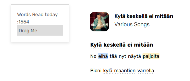
I’m most interested in seeing chosen statistics live or every time I move to another sentence.
•Words read today
•Words read overall
•Maybe new words today
This is already in HotKeys. New words today I could add.

Perfect! Thank you!! ![]()