I like several improvements, especially that it remembers where I left off in the audio of a lesson. However, I haven’t figured out how to access the translation on those lessons that supply one for the full text.
is not possible to return to the version 4 but this is something that helped me:
message of user virgilinojuca:
I tweaked with a userstyle to make the sidebar use more vertical space. I didn’t test it a lot yet, though.
It’s supposed to look something like this:

This is how, in my opinion, LingQ should have designed the new reading screen.
It can be installed by creating a userstyle with a browser extension such as Stylus, pasting the code available on the link below, and setting the style to apply to lingq.com.
The code:
User ColinJohnstonov also made an userstyle for another purpose and explains in his topic how to install it:
Now I published the userstyle in LingQ 5.0 more compact sidebar — UserStyles.world
this may help a little:
message of user virgilinojuca:
I tweaked with a userstyle to make the sidebar use more vertical space. I didn’t test it a lot yet, though.
It’s supposed to look something like this:
This is how, in my opinion, LingQ should have designed the new reading screen.
It can be installed by creating a userstyle with a browser extension such as Stylus, pasting the code available on the link below, and setting the style to apply to lingq.com.
The code:
User ColinJohnstonov also made an userstyle for another purpose and explains in his topic how to install it:
Now I published the userstyle in LingQ 5.0 more compact sidebar — UserStyles.world
Comparison:
Sidebar’s width
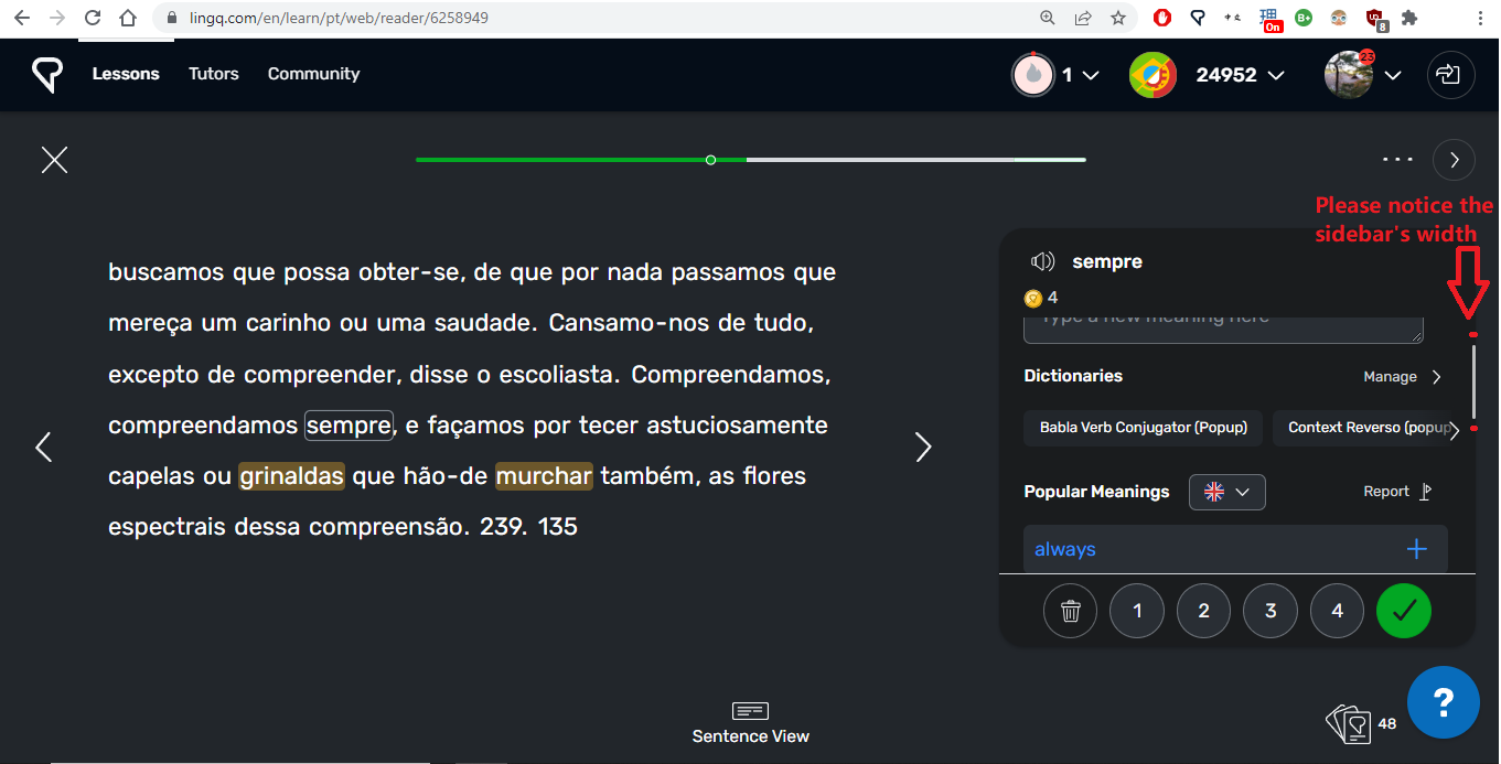
vs Forward arrow’s width
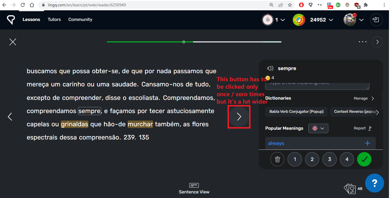
As others have pointed out before me, it used to be possible to see three popular meanings of any given word, now only one. So scrolling down in order to check more meanings is now even more important than before, but the sidebar is so narrow that it’s difficult and inconvenient to click on it.
It would be a great help if more meanings could be viewed at once, and also if the sidebar was easier to deal with.
Thanks,
I have the same problem.
Firefox still is unusuably slow for me and in Chrome, it takes forever to load the overview at the end of a lesson.
Thanks Mark!
The new version is absolutely awful. Everything is harder to do. It’s much harder to browse course and find what you’re looking for. All of the pop up windows are a pain.
When you finish a lesson and don’t want to do another it’s annoying that you have to close the pop up and then press the x rather than being able to go from the pop up straight back to the main page.
It’s overall way more clumsy to use and to navigate. This was totally unnecessary you had a great product and ruined it. If it ain’t broke don’t fix it!
My professor back in college used to joke that every time they update Microsoft office that buttons get rounder and shinier and finding what you’re looking for get’s harder. Certainly true here!