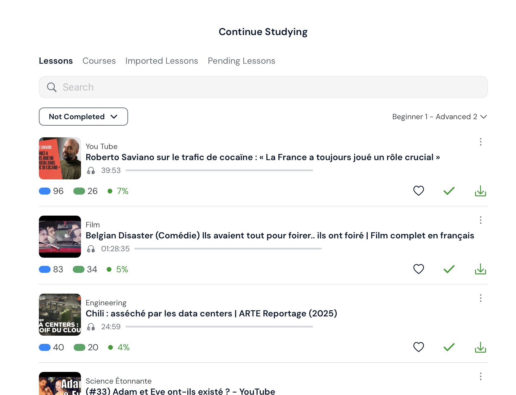
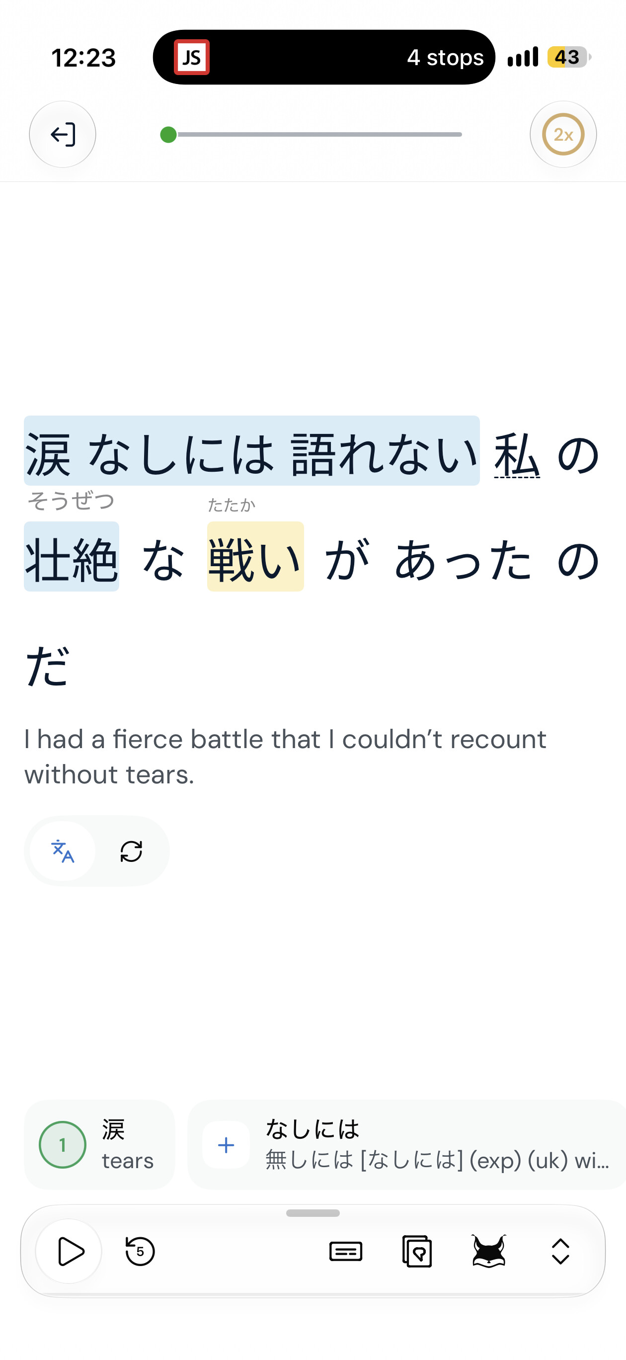
We’re launching a new iOS beta featuring a redesigned Library and home page, along with a redesigned Reader and other major changes. It’s similar to the Android Beta that some users have been testing recently.
We’d love to hear your thoughts on these changes before they’re released more widely. Please use this thread to share your feedback, suggestions, or any bugs you encounter.
Generally a pleasant interface with many welcome improvements. One comment I will make is that I saw no way to sort the list of videos, so I was unable to find ones not completed. I used LingQ Classic to find and open a video, then switched back to LingQ NewFangled to watch it.
I do like the direction, but would prefer to allow the text to fill the whole width of the screen in portrait mode on an iPad. I find the floating sidebar to be distracting when I’m trying to read (until I need it to look up a word, of course).
Very nice and promising update. Couple of bugs so far:
If I leave in mid of lesson, progress update appears, but click on new words doesn’t work.
In theater YouTube mode subtitles are slightly out of sync, marker is on previous sentence while audio is ahead.
In sentence mode on iPad layout is strange, very small video in left column, while text is on the right. Much better would be to have like on iPhone, with YouTube video filling half of screen and text under it.
And I like autoadvance mode in sentence view, but would it be possible to add a 1/2/3 sec delay option? Some sentences I need to read slower, or check new words.
I like being able to click on a word while watching a video. However, the second line of text is cut off on the bottom. I am using an IPad in landscape mode.
@kfb
Regarding the floating sidebar, we are pushing a fix to the bug where it doesnt dissappear after finishing a lesson.
And regarding your first comment “I find the floating sidebar to be distracting when I’m trying to read (until I need it to look up a word, of course).” → So you would prefer to not see the sidebar if you don’t have a word opened to look up?
This should be fixed on the latest version (7.0.0 (5)
Theatre mode uses the same timestamp timing as the other modes. So I imagine that what you experienced is a general timestamp issue with that lesson. Unless you can confirm that the sync was off in theatre mode but not off in a different mode. Please confirm.
Yes, we will make video on top the default in sentence mode on iPad.
Yes, exactly. I’d like a mode where I can have the text just fill the screen like an ebook reader, and only invoke translation/LingQ creation tools as I need them.
I find it tends to lose the place in the text. I’m using it with the video display top left, and the text down the centre, So as the video plays, the current location is indicated in the text with a dotted underline. I think it’s when I stop and click in the text to look up a word, or move the text to the previous page to see what went before.
The lack of being able to order videos is a major omission, but other than that, it’s a really nice design.
Hi. In latest beta Japanese parser doesn’t split words properly, while stable version does better job. Plus suggested words in sentence mode if it doesn’t fit on one page. It is not user friendly to scroll on the right. Stable version is much better where you can see all words on one page
Are you able to share a link to this lesson so we can take a look at it? Also, are you sure that first blue term isn’t a blue phrase? We are now suggesting phrases in blue in the beta version, so you can save the phrase and then click on the word underneath to look up and save the words.
With regard to the list of terms, depending on the number of terms, listing them vertically often also means scrolling to see the term you are looking for. Where I used to use that list, I now find that activating the new micro pop-up, which shows directly above the term, is the easiest way to simply tap terms as I go, because I don’t need to change my focus away from the text.
Just wondering what your thoughts are. We are trying to figure out the best way of dealing with the vocabulary list, but on a phone, it’s always going to be space limited.