This is again about the reader (which is not really up for testing yet, right?):
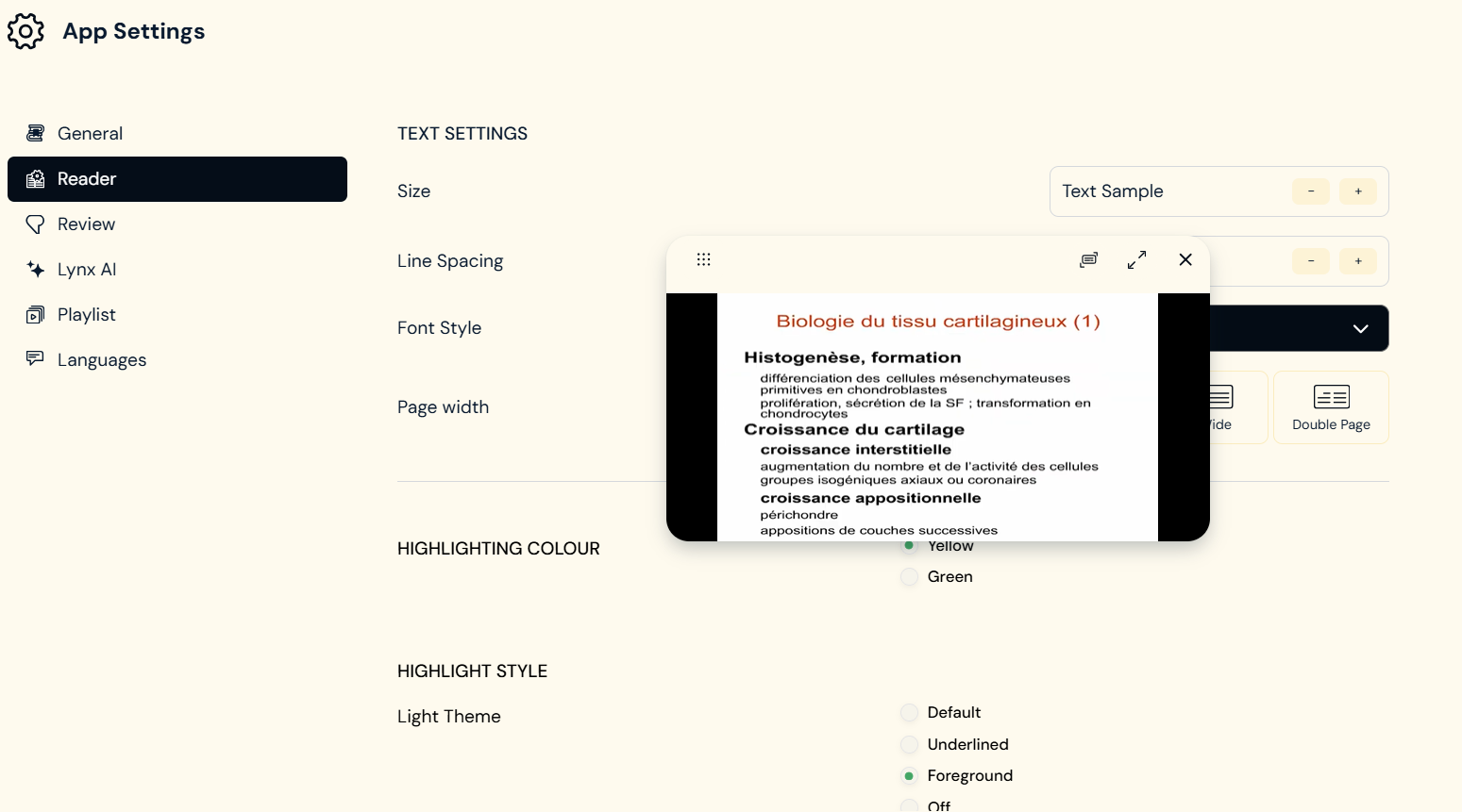
While I was reading a lesson text, I was also watching the video that came with it (, which always covers a bit of the reading text), I wanted to change the page width through the settings within the reader. With the open settings, the video window which is still at the same place is not movable anymore.
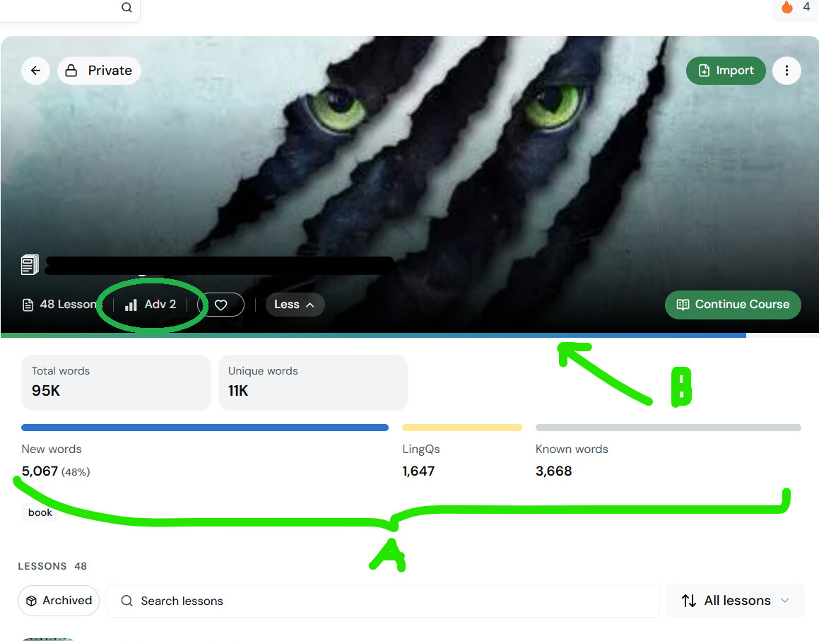
One thing I really like: the course view. I like how there is a line (A), which is devided in the three parts New words, LingQs and Known words and the second (maybe a bit to thin?) line for the reading progress (B). I was just wondering, why you chose these specific colors in the progress line (B). As a LingQ user blue stands always for the unknown/beginnings. So why would finishing a book feel like I am still at the beginning?
And seeing that you gave the lesson levels in the library a specific color*, it would make sense to give the level marker of the course on the bottom of the course picture the same treatment.
And maybe the “Archived” button makes more sense on the right side next to “All lessons”?
(Blue for beginner levels would make more sense.)
Edit: And one more thing: An overall view with all of the languages that I prioritize right now, like in the Android App, would be great! At the moment I use four widgets on my iphone to see which language I have not studied yet on Lingq today.
I really like the new website layout. I particularly like the fact that the imported YouTube videos remain fixed in place whilst the text flows below them. If possible, I’d like the option to resize the video to extend it to the left and right. There seems to be enough space on the page.
When I am in the Library or in a lesson and click on “Forum” on the left side, the page changes into the “Forum” page where the latest topics and the ranking is shown. When I click on “All Forums” there, the page changes into the Forum main page. Everything happened within the same tab.
But when I am on the Forum main page and click on Lessons, Tutors, Challenges, … (in the top line) a new tab opens. That seems a bit strange. I’d rather return to my previous place on Lingq and not to my last read thread in the Forum.
I’d prefer - when I am in the reader view and click on “Forum” - to have a new tab opened, that shows the Forum main page directly. That way my lesson (or any place I started from) is still open in the first tab and I can go back without opening a new page from where I have to open my lesson.
As I like todays addition to the Android version, where with only one tap I can see all my languages with my daily goals listed, I wish we could have something like that in the web version too.
Maybe you can add a goal icon - similar to the activity icon - on the left side bar, where we can hover over, to see all the languages that we are learning with their individual goal.
In that case it would be also great, if there was also a function (e.g. in the settings “Notification”, where we can choose for every learned language, if we want a weekly report via email) to make languages kind of invisible in the “collected goal list”, because there could be languages that someone is not learning actively at the moment or they have their own mother tongue(s) in the LingQ list, but they don’t need specific goals for them.
Edit: It would be great to also see at least the small side bar on the left while I am on the settings page.
Do you mean that you are only able to open it in a new tab, and you cannot click it and have it open in the same tab?
if so, I think that is the fault of the web site designers. I think they have to make it just a regular hyperlink for us to be able to choose which way we want it.
If they hardcode it to always open in a new tab, then we lose our ability to choose, so that is always inferior in that respect.
This is related to our use of Discourse for our forum. We might be able to change this, but for now you can just right click and select ‘Open in a new tab’ when selecting the forum button from the reader, as zorbital suggested. But I’ll forward what you suggested to the team.
I use Microsoft Edge.
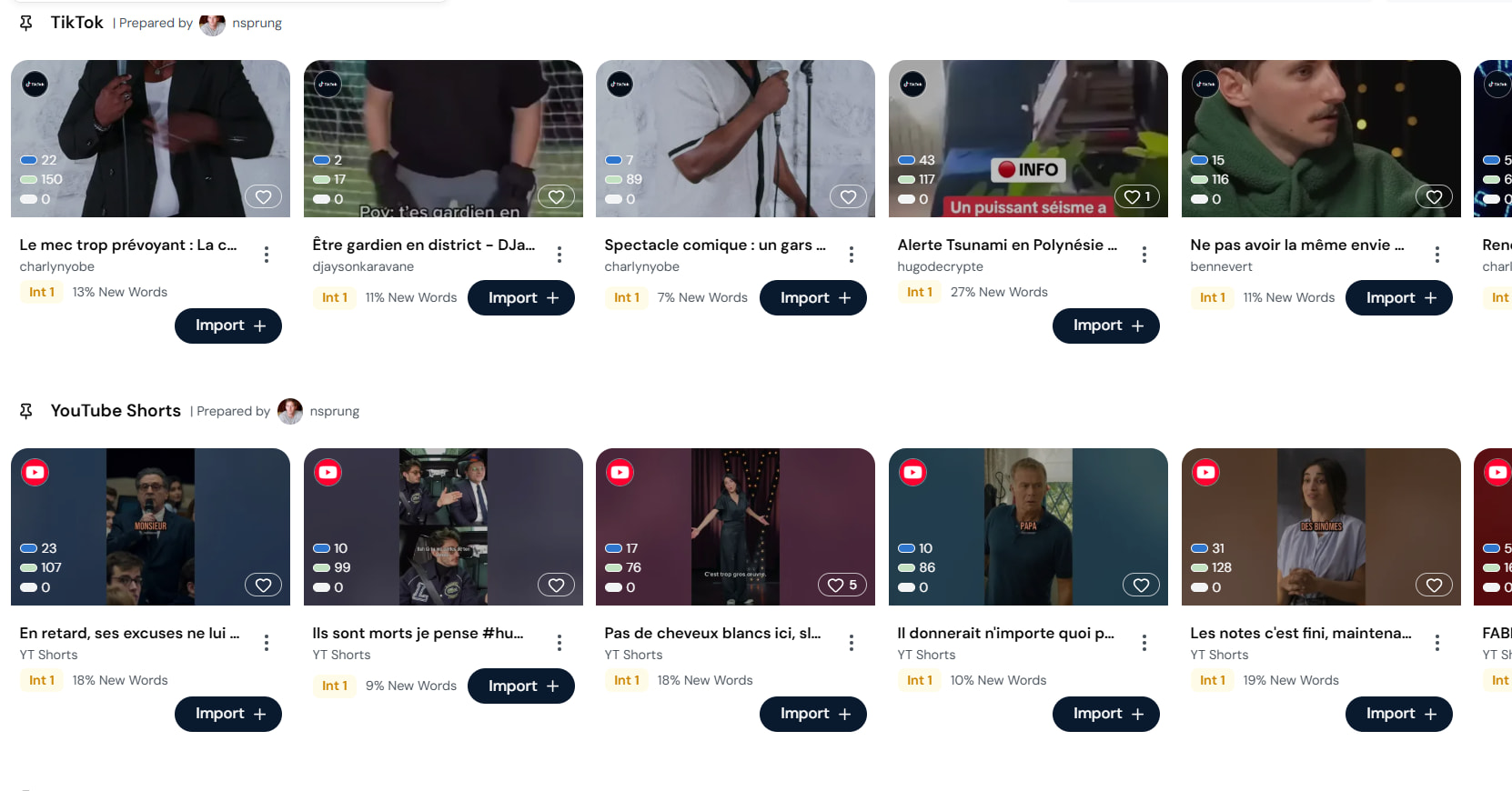
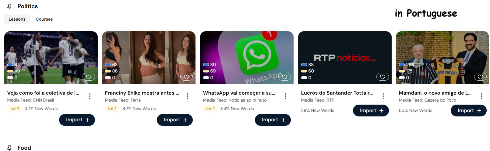
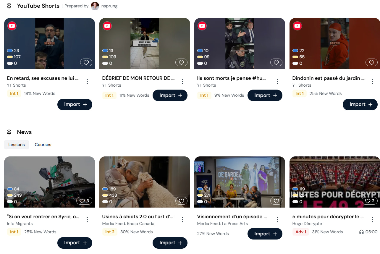
I think, the placement depends on the percentage of New Words for the user and when the lesson level is missing, then there is also enough space for the field to fit next to the percentage.
Edit: That will be no problem for the German interface, because the import field is longer and New Words also has more letters. I did not check other interface languages.
On that matter: Please change the level Mit. for Intermediate to Mitt. (for Mittelstufe).
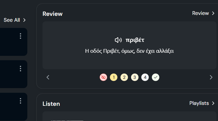
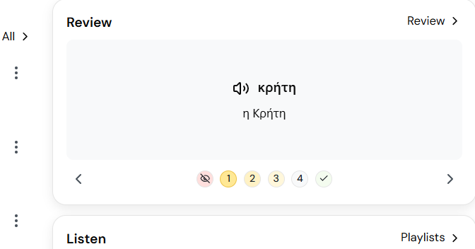
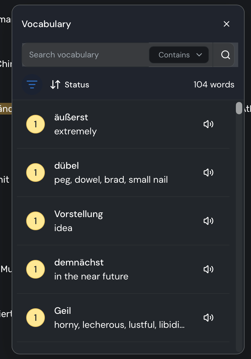
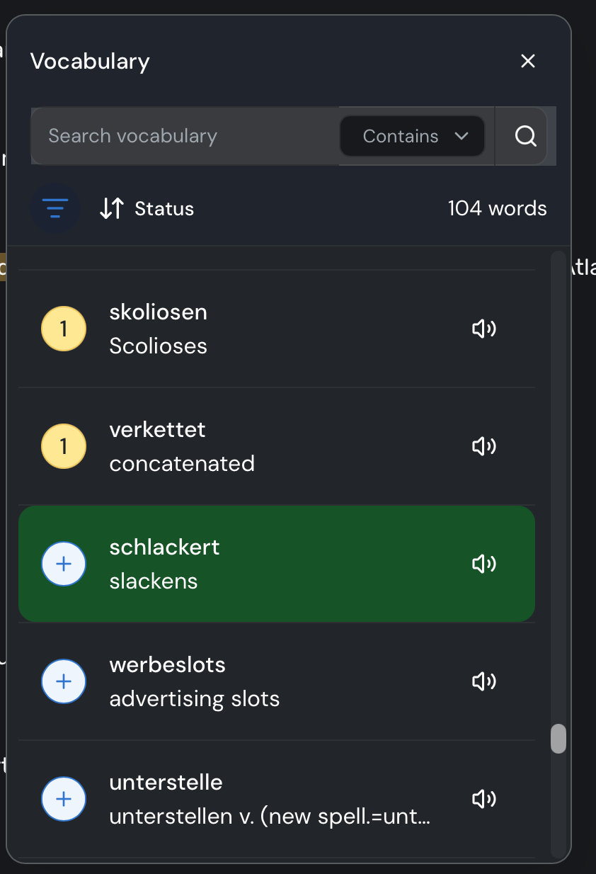
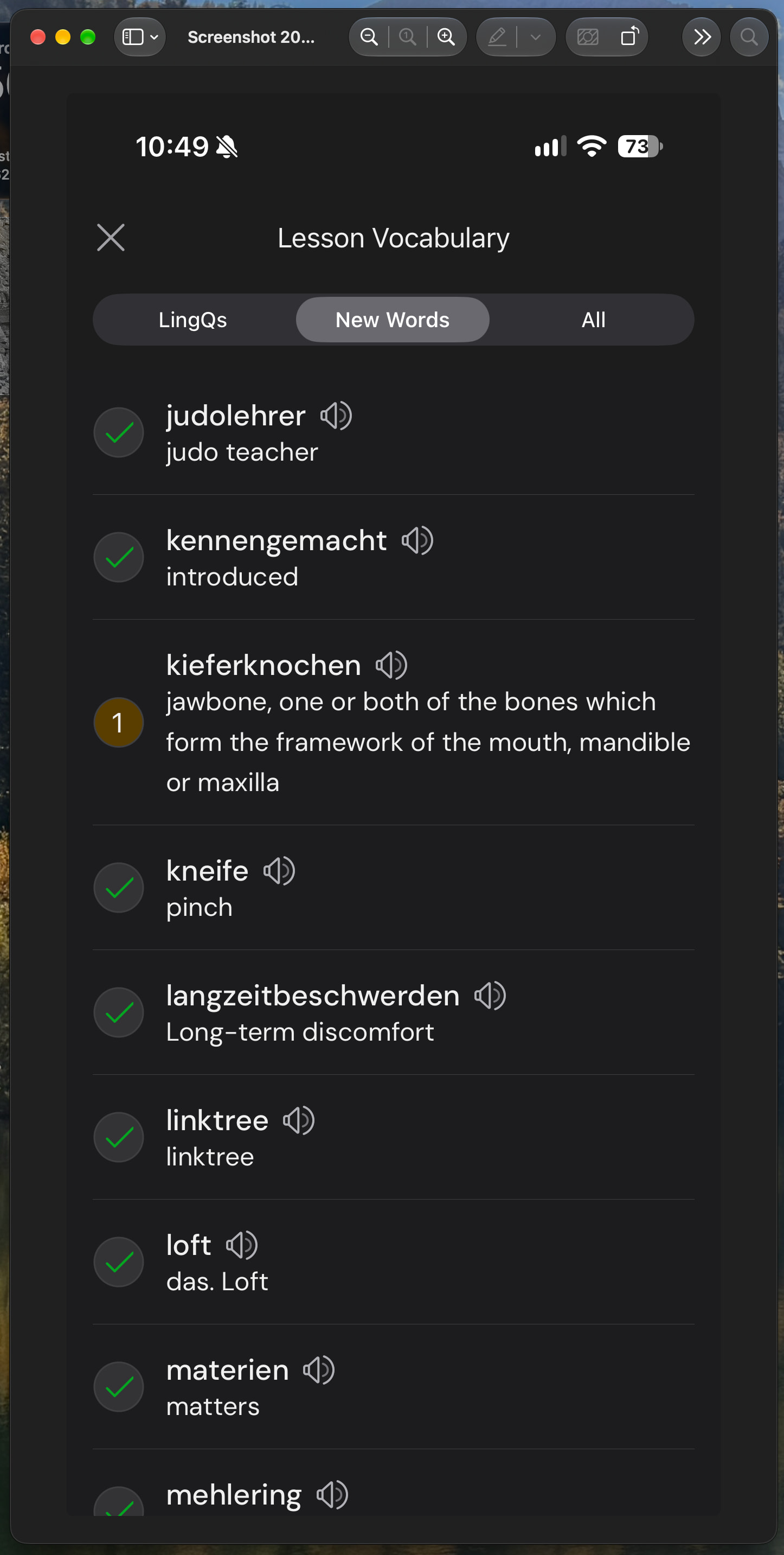
I am quite fond of the short vocab review possibility in the library. But it is not working as it should be, I think. First of all, it is very difficult to see which level a lingq is on. [At least for me on a laptop, where I use the dark background most of the time.]
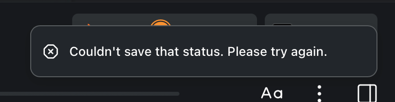
So today I ran through the review and even changed the level for a few words (where the circle around the level showed up nicely). But the new level did not stick. When I go back to the last card, the level is the old one. And even after finishing the whole set and refreshing the page, I earned a few coins (for what exactly I am not sure), but when I go through the Review stack again, the new levels do not show up.
I, as a user, would prefer to make my own choice about which pages are opened in the current tab or in a new tab or in a new window. I would prefer the web page not force a new tab or window on me.
I think it is working pretty well now, and certainly when I am moving lessons to other courses, the list is definitely listed from most recently used to least recent. That’s a huge help! Makes the app so much easier to use in that moment.
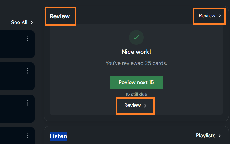
As I already wrote somewhere else, I am quite fond of this little review option in the library (and the app homepages) . But I still have a few issues with it:
Please name at least one of these Reviews (in orange) differently.
Maybe you could also add the possibility to edit a word from within the review option? Maybe with a keyboard short-cut? Or instead of the going-back arrow there could be the edit symbol? Or the editing symbol could be shown on the back of a review card?
It would be great if it would be somehow made visible that I did the review for that day already. That request may sound unnecessary, but with the same feature on my phone now, during the last weeks I did use the review a few times a day for short periods on the train or when on break for different languages, so in the evening, when I have a longer learning session to reach my goals, sometimes I am not sure if I did the review for a specific language already.
Maybe the Review field could get a green frame or something like that? (I wrote green, because LingQ uses the green checkmark after a review session is completed.)

 . But I still have a few issues with it: