I love LingQ in theory, but I haven’t been using it because the library is terrible in general, and managing imports is even worse.
Current Complaints:
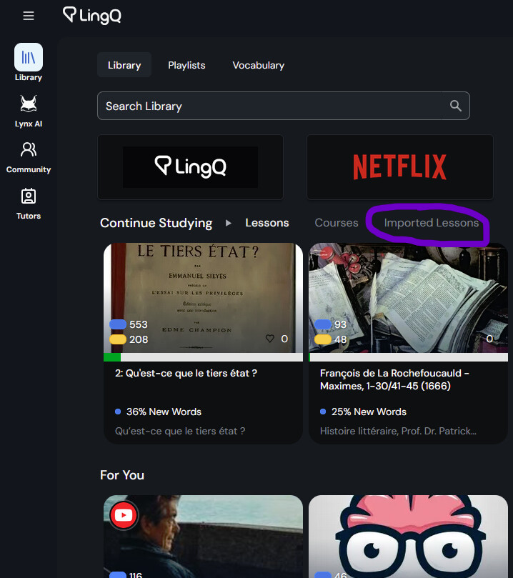
The ‘discovery’ style screen where you see different options like Guided Courses, For You, Trending, News Feed, etc. is bloated and it is unclear the difference between:
A well made course of lessons
A recommended import like a news article
A youtube video with autogenerated text
etc.
Once I open something it is often unclear how to find it again except hoping that it is at the top of my “Continue Studying” when I get to it, often it isn’t.
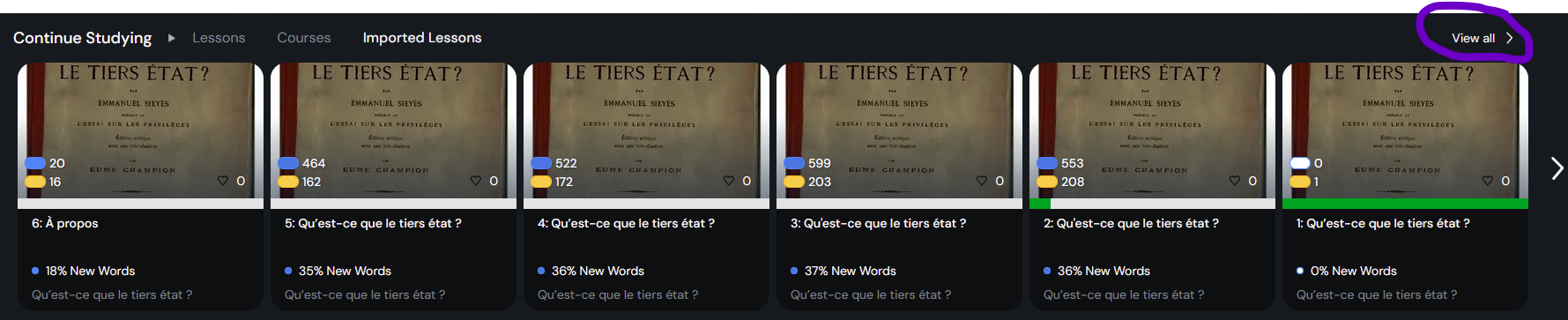
The “Countinue Studying” gets incredibly bloated. I browse around for 2 minutes and all of a sudden I have 20 new things permanently (?) clogging up the one reliable place for returning to reading.
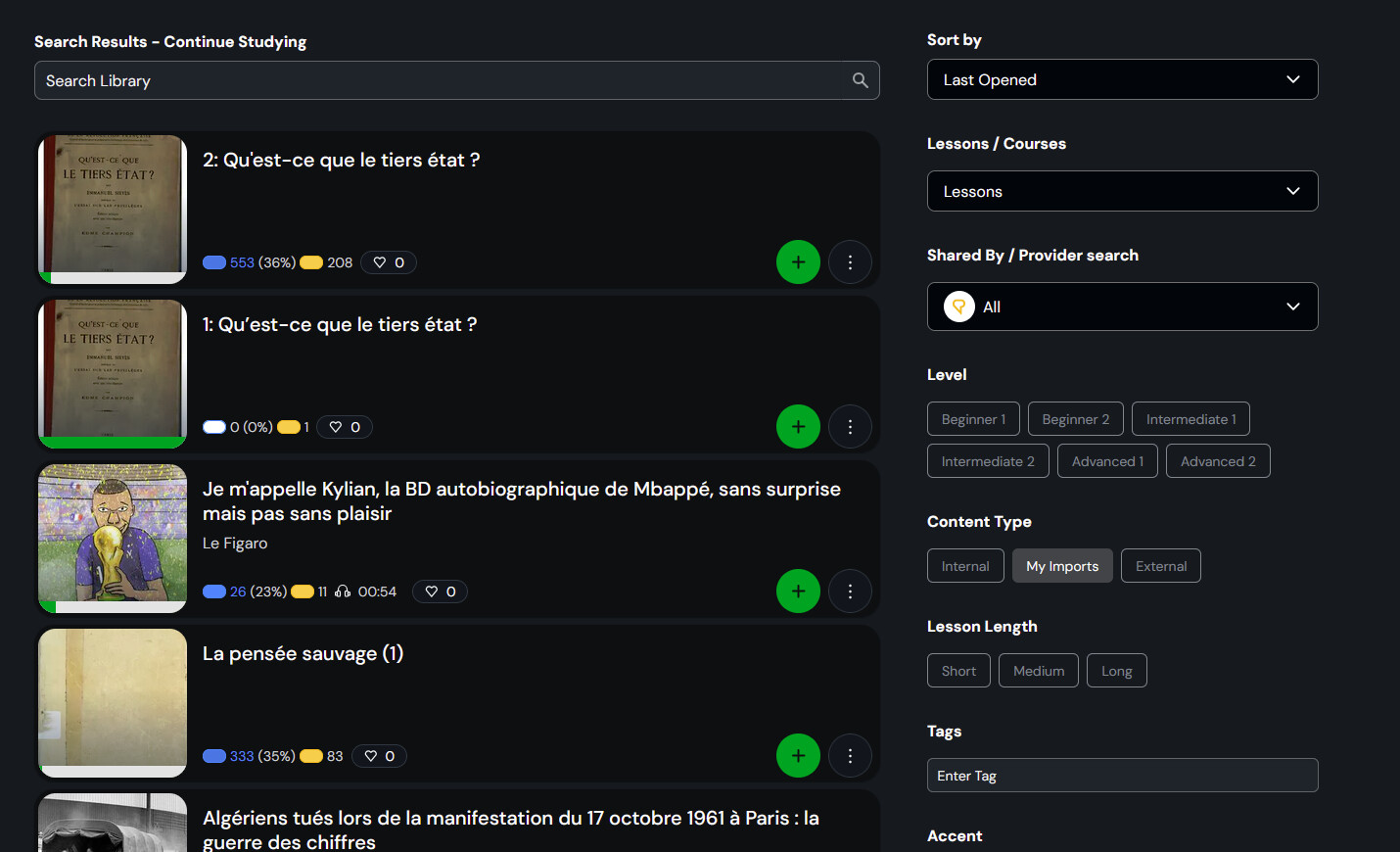
I mostly want to import my own books/pamphlets. In order to find them after I’ve uploaded them there is no “My Imports” tab anywhere you would expect (next to [Library] [Playlists] [Vocabulary] up the top is where I’d expect it). Instead you need to know to go press this tiny greyed out button “Imported Lessons”.
I am a computer science student and former linguist who would be keen on writing y’all up a recommendation document for how you could make something more useful, if anyone on your staff would assure me it’d be read.
This should be of business relevance to you, as I’ve sat down with multiple people I’ve recommended to to show them how to use LingQ, and the ugly and unwieldy library has been the major sticking point every time.
Totally agreed. This is the most annoying thing I encounter while using LingQ. You raised a valid issue. Hopefully, they take a look at it. One workaround I have found is that if I open the first lesson of an imported course immediately after importing it, the course will be added to the “Lessons” tab, making it easy to browse and study. However, if I have imported many courses and completed many of them, then it is a huge mess. You should share inputs on how imported, finished, and unfinished courses should be organized under their own tabs.
I think the netflix style presentation with way too much screen real estate taken up by often relatively unhelpful icons exacerbates this navigability issue. I can only position 8 icon on my screen on the library tab. If I open a course I can only fit 3 lessons. For longer courses like audiobooks and podcast feeds it is very cumbersome to navigate to a resource even if you know where it is!
I’ve gotten kind of used to doing it all now, but it could definitely be made much more efficient and user friendly!
Totally agree. We should be able to create our own shelves and put our courses there. Completed courses have no place on the continue studying shelf. They should look at Google Play Books to see how it’s done.
100 % agree. The concept of LingQ is great, but the basic interface needs to improve. Also basic functionality like importing a YouTube video which then switches to the wrong language just isn’t being fixed. Fix the basic product first before adding any ‘'add-ons’.
Glad to see there is some shared sentiment on this. And I agree David12scht, AI can be very useful and language learning is a good place to use it. But beyond some better text-to-speech, and some ai translations, which are already well integrated, we don’t need anything more crazy.
I’d love to hear from somebody on staff as to whether they agree this is an area for growth for the app. If there is no intention of improving it, I’ll probably migrate away from LingQ at some point soon