Thanks, I see similar things now when following your steps. I have reported it. Not that common a behaviour so relatively lower priority but we will try and resolve this.
Room for improvement: When I import a long lesson that gets split into parts, the only indication that this has happened is the “(1)” that gets added after the title of the first part. This may confuse new users, especially as it can take time for subsequent parts to appear. Perhaps let users know that their lesson has been split and that LingQ is in the process of creating subsequent parts?
Possible bug: Sometimes I wait and wait, and the subsequent lesson parts never seem to appear. This actually happens pretty frequently. Perhaps I should be more patient. Instead I usually delete the lesson and try again. Other times, the subsequent parts appear immediately. So I’m not sure why it stalls sometimes.
Missing feature: In my experiments dealing with the possible bug above, I created a few versions of the same course, and later wanted to delete them. In v5, “deleting” courses seems only to remove them from “now studying”. I could not find any way to actually delete courses, so I had to switch to v4 to do this. Any plans to bring this feature to v5?
I know I said before, after switching to Chome, that v5 reader is really fast, but I notice now that on large lessons with a lot of unknown words it is still very slow. Clicking on blue and yellow words and saving lingqs takes a second or two. In smaller lessons it is lightening fast, but longer ones are slow. The same lessons on v4 are very fast.
Thanks, we will look at making the UI clearer. The fact is that the parts will eventually appear even if they seem to be hung up initially. We are trying to understand why things get hung up sometimes.
Courses do seem to be deleted for me. There is a delete course option in the Course menu and when editing a course.
We are trying to resolve speed issues. I don’t see anything that slow for the most part. It seems like something that happens occasionally.
I don’t think it is an occasional thing. I think it is a thing that is noticable when there are a lot of lingqs in a text. Any lesson I open that is very white or very yellow but short works as fast as it should (on Chrome) but anything longer that is very yellow is really slow.
Nice to see that “popular meanings” are back for imported vocabulary! Thanks!
I’m sorry if this post comes out as too harsh but…
UIX of beta 5.0 is bad. I don’t know where does obsession with white space and “hiding” information from user come from.
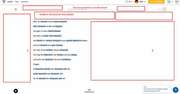
- When you are on the second (non-first) section of the lesson, you can’t see the name of the lesson anymore
- When you are on any section of the lesson you can’t see how many segments are in the lesson, how far you are into the lesson etc.
- I haven’t calculated it, but there is way more white space than information on the screen.
While I can understand that “meta” of webpages are towards minimalism and “responsive design” buzzwords, this should get another look. And yeah, LingQ becoming visually minimal as Duolingo is absolutely not a good thing. I can’t imagine someone using LingQ beta on 1440p screen 
Sorry for my bad English, I’m willing to provide more info and even more critique (heh).
How long are these lessons? We’re really not seeing that. Are these extremely long lessons? How many words?
Design choices are often popular with some and not others. We have tried to make all data still quite easy to access. You can see the title by hovering on the progress bar on any page, along with some word stats and the segments. A little more work but for this information that you only need occasionally, kind of a good compromise.
Meh, I know how to get to that info, I just don’t get why it’s so hidden. I guess it’s pointless to even talk about it.
Are you guys still looking for feedback on the basic look of the reader? Personally I kinda like the minimalist design. I would like in fact even less on the screen in a way. Here are my comments, many of which are similar to the previous comment, based on the red letters in this image
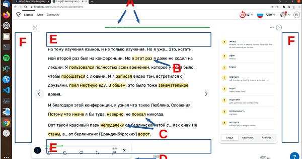
A - I think it was better in the previous reader that the progress bar showed the boundaries between individual pages. Strangely, this is actually case in the new reader but only before the current progress. I can’t see the reason for this and it looks like a bug.
B - Level 3 phrases are often very hard to see. They blend in too much with the white background.
C - The two arrows are pointing at a level 1 and a level 2 lingq. The shade difference is barely noticeable. The distinction between levels needs to be more clear.
Related to B and C - The color scheme on reading page looks too washed out. In previous versions, the colors were popping. I think it was better previously. I do prefer the new design in general but not the colors.
D - Here I am playing the audio and this audio bar is present. It has a shadow on the bottom and sides which I presume is there to give it the impression that it is somehow floating above the page. That looks fine, but it gives the impression that it should be possible to drag this box around in the window.
E - So much vertical space is being wasted here that I think should be used for text. My problem with the previous v4 reader and with this one is that not enough of the space on the window is taken up by the main text box. If I am reading a longer lesson, it would be much nicer to see more of it at a time.
F - Also horizontal space wasted, but I am not sure there is anything to do about that since the text box should not be so wide of course, so maybe this is fine.
Anyway, I hope this is useful.
How do I get to the resources (specifically the translation of the text put in by the provider) on the lesson page?
Ok, maybe I am wrong with it being not an occasional thing. The lessons that were running slowly for me before seem to be quite fast now. No idea what was up. Will see if it starts up again.
Edit: well actually it seems that they are a little slow, but only when using the arrows. When I use the mouse, it is really fast. This particular lesson is 2006 words, 175 new, and 456 lingqs.
A couple more issues.
-
If I create a lingq and very rapidly set it to known (only really possible with the keyboard and probably only likely with lessons that a running a tiny bit slow), the lingq is created and stays highlighted yellow, but moving between words with the arrows skips that word. It can be clicked on but not navigated to with the arrows. I guess maybe when hitting known on the word, it is removed from the list (or whatever data structure is used) that holds the words that can be navigated to with the arrows. It could be easily fixed in this case by making sure at the end of creating a lingq that the word is present in this list though it’s a somewhat special case and maybe best fixed by making sure speed is not a problem.
-
More of a real problem is when navigating between pages words are autohighlighted, which itself I find a bit strange when doing it with the mouse (it’s especially annoying when auto tts is on). The problem is, very often the wrong word is highlighted. Presumably it should be the first blue or yellow word but sometimes it is not. This is even true when navigating with the arrows. Here are two examples
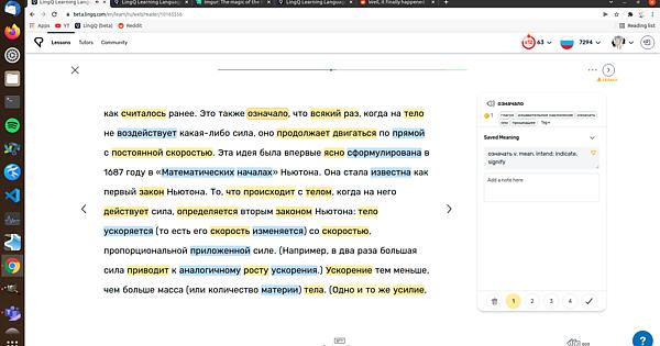
I like the design. For those who think it wastes space, I suggest showing definitions on the right (rather than in popover). For those who find the highlighting hard to interpret, I suggest setting “highlight style” to “underlined”.
Regarding design, I have two requests for improvement (both of which I’ve mentioned before):
-
The help bubble in the lower-right has become even more distracting, in that it now presents me with this message whenever I open LingQ or switch to a different part of the site: “Hi! Do you need some help getting started in your language journey?” I’ve already had to dismiss this message dozens of times in the few days since it was implemented. Please let me turn this off forever. In fact, I’d like to make the help bubble disappear entirely. How many of your experienced users will actually use it? (My answer: never.) If users need help, it’s just one extra click away via the profile menu.
-
Lessons that were created in v4 display the word “LEGACY” in the upper-right corner. Already, several users (including myself) have convinced themselves that this label applies not to the lesson, but rather to some treasured interface feature. I imagine you will see more such worried messages as the final version launches. (The confusion is heightened because “LEGACY” appears only when definitions are shown on the right.) As far as I have learned from the forums, there is no difference between new and legacy lessons, as least in terms of reading the lesson. Perhaps the difference has to do with editing the lesson? In which case, why even bother users with this warning when they are reading the lesson? Instead, why not display “LEGACY” only on the edit lesson screen?
100% agree with the annoying help bubble. I am also annoyed by the bubble at top right that is not useful at all to me. I’d much rather see the lesson title, blue and yellow word count that are hidden in the progress bar.
@christooss: If my screen looked like yours, I’d be feeling the same way. But here’s my screen right now:

Why does my screen look so different from yours? Other than my choice of dark mode, I’ve also got the definitions showing on the right (rather than in popover), and the text I’m reading has longer paragraphs than the ministory you are reading, and so takes up more horizontal space. Perhaps screen space makes a difference too: I’m using a 13-inch laptop. I’ve also switched “highlighting mode” to “underlined” which I greatly prefer.
Not sure if you’d agree, but to my eyes the balance of empty space is perfect on my screen. I don’t mind not seeing the title, since when I’m in the midst of reading I don’t need that information. Yes, I miss how the old reading line was segmented and colored, but if you look at the previous beta discussion, you’ll see that the team is working on this. I guess I’ve gotten used to hovering over the reading bar to summon certain information that was previously always visible.
I don’t think it’s pointless to talk about design. I suspect that the big choices have already been made, but there may still be room for refinements, if you have specific thoughts to share. No promises of course – I’m just another user – but that’s how the process has seemed to me so far.
Another bug. This one quite annoying. I find that when moving between blue/yellow words using the arrows, it sometimes would highlight a word that is known. After some testing, it seems to happen when that word is part of a saved phrase that has been set to known. Navigating with the arrows won’t highlight the phrase, but it will highlight one or a few of the words within the phrase even if they are set to known. I can’t find any clear patterns for when this happens and when it doesn’t but it does seem to happen very often.
Aaaaaaand another one. I find that when I am looking at the hint in the sidebar for a saved lingq and I click the + symbol on the right of the hint to add another hint, and then I navigate to another lingq without interacting with the box for saving the new hint, the box is still present in the sidebar for the next lingq. I can even save a hint for the next lingq using that box.
Request for greater readability: In dark mode, in the “Popular Meanings” section of the definitions panel, the contrast between the blue text and the grey background is insufficient, and makes this text hard to read. The contrast here is certainly less than elsewhere on the reader page, which generally uses white text on grey background. In order to comfortably read the “Popular Meanings”, I have to turn my screen brightness up, which then makes the white text elsewhere on the page too bright. Perhaps a slight tweak to the color scheme could be considered?