First let me say then I love the introduction of the AI chat bot and in the future I hope that it can be integrated into the pages of a lesson as well! I also love the new colours since it makes the levels easier to differentiate.
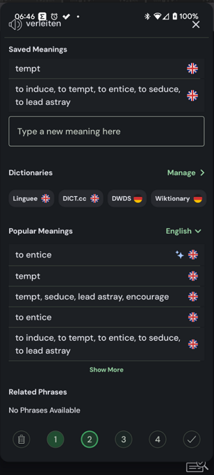
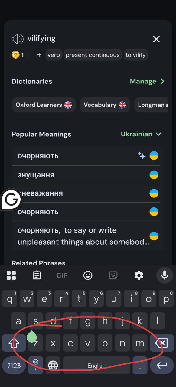
When I create a lingq, I am not able to write my own definition until I select one of the automatically generated ones. Then I have two, and I am now no longer able to delete definitions.
Agree. Love the colours and overall presentation, but there is a bug preventing the user from amending/deleting a definition or writing their own from scratch. There’s also an issue with tags. Either it’s impossible to add them because the option simply isn’t there or the + button doesn’t work.
Did anybody test the Android app? The translation for blue words are not displayed at all, I have to select at least 2 words to see the google translations ang guess the meanings of a blue word in a selected phrase. It’s the most annoying bug.
But it looks nice.
Agree 100%! I was going to conact support for this as I’d rather roll back to a previous version if it stays like this. New colors are fine but should be changeable by the user
Can’t add my own word to a definition or edit it.
Can’t see all definitions at once, have to keep pressing see more.
Plus it looks like all the definitions new are AI rather than the user inputted/most popular options like before.
Major fail to change one of the most important parts of the app imo
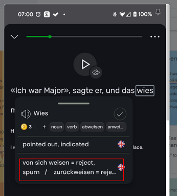
Tapping of verb tags (including variations of verbs) don’t result in opening of the word in reverso conjugation popup dictionary like before. This is an especially useful feature for the german verbs as most or all of the prefixed forms of the verbs are included as tags and clicking them would bring up reverso conjugation with that verb form and meaning.
Sometimes longer meanings don’t fully show in the initial pop-up completely. They are cut off. Possibly with multiple meanings.
One other problem I haven’t seen anyone mention (I think):
When I tap on an never-before-seen-word, trashing the word (or clicking the check to mark the word as known) does not cause the pop up box to disappear, so I need an extra tap for every word I am trashing. It used to be that trashing a word also automatically closed the pop-up box.
I just wanted to start with my first Persian story and wondered where the text was gone… everything blank blue boxes due to dark mode. I switched to light mode but that hurts my eyes .
Another issue I just noticed is the audio counter: it basically set all my listening times to zero. I kept track where I was in the mini stories through this. Very sad this has happened
Addendum: listening isn’t possible anymore on the app(haven’t tried web yet). The audio stutters…
I just uploaded the android app and it is almost unusable… the blue words do not have definitions popping up and the definition box on the right side have become so small and it moves and goes almost out of the screen! Also in the dark mode, some buttons are completely blended in with the dark background like play the audio button or the cross button on the left top corner. It was not like this before. Is there any deadline to update the android app altogether so that the app is reusable again?
Similar issues here - since the update yesterday, reading on my tablet in landscape mode is largely ruined, I’ve just got a big space on the right where the translations should be, tapping words produces popups in all sorts of locations (including almost entirely off screen). Same on my phone, very frustrating!
Due to the very large font in the dictionary review, which I cannot figure out how to make smaller, I can see only part of words’ definitions. Moreover, if there is a new-line character in the definition (e.g. “formal\r\n blah”) I can see only “formal” and cannot see “blah”.
Thank you all for the detailed feedback. Version 6.0.1 was pushed and will be available as soon as its reviewed on Google Play. Meanwhile here is the apk if you want to install directly. I personally apologize for the issues caused by this release. The goal wasn’t to remove features or upset anyone, but instead to improve the app experience. We hope things go smoothly from now on. Let us know about any other issues remaining after the update. APK: lingq_6_0_1.apk
For me the colours on android are now green for words being learned and blue for new words. They are basically indistinguishable and i cant really use the app anymore. What was wrong with the yellow? Is there any way to change the colours back?
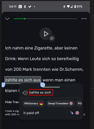
Also just adding some issues I’ve seen: when you click on a word the box always pops up under the word which means if the word is low on thr page the box is half off the screen
You have to do multiple taps now to click if you already know/want to ignore a word and then another tap to close the box. It was just one tap before (i think the box auto closed?) which was faster
For some reason I think the tick and the ignore bin have been switched around so muscle memory has led to ignoring some words I wanted to add. That’s a bit frustrating doesn’t seem to me something that needed changing around
Generally something about adding words and then defining levels feels chunkier but it’s hard to put my finger on it
For what its worth its now much easier to swipe up and open up the new word box for more definitions. The hit box was v small before and I’d have to swipe a few times