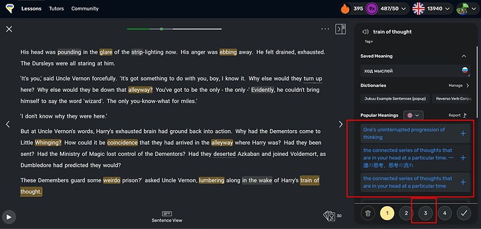
When I try to add new words I want to click on numbers 1-4 in the right bottom corner. At this moment the UI block with “popular meanings” often expands and I missclick to the link because it shifts unexpectedly. I have to return back and wait loading the page again.
Instead of jumping HTML blocks it’s good to make this height 100% for all cases ant it will be more predictable.
Thanks for reporting, we will look into it.
