Unfortunately, no. It did not help. I changed the setting as you indicated, but it made no difference. I wonder what else could be influencing the background colors as you are able to discern known, and learning. I can only see whether a word is highlighted as status 1 - 4, if I choose blue as background color for the lesson. The highlighted fields are however always white. In other words, no difference in background color of the learning words (or unknown words). I really hope I can get this solved as it makes using lesson so uncomfortable. Before this sudden change, I could see where the new words and to be learnt words were in one go, just looking it over. Now, only in blue I can see something is highlighted, not whether it is new.
I also prefer dark mode with the way it highlighted the words. I don’t really mind the current system but it doesn’t seem to highlight “level 3” (familiar words) anymore. I created phrases manually and put them as familiar but now I don’t see them highlighted with the current update.
Other than that I’m still hopeful that the Lingq staff members will fix these issues and make Lingq a real beast of an app.
Just wanted to chime in that I’ve been refreshing these threads every day since dark mode was broken, hoping for good news. The alternatives suggested under the “Aa” options, do not have a dark mode equivalent and are much more difficult to see / distinguish between the different levels of LingQs.
It’s honestly impressive how bad it is… Day two and I’m shocked at how much motivation I’ve lost because of this. C’mon LingQ, just give it the ol’ Ctrl+Z and we’ll forget this ever happened!
This is unfortunately my experience as well. This change needs to be reverted.
If you’re going to add a full custom theme designer, then fine. But no option for a fully black background is just awful. Please just put it back so we can use it again.
I agree with the above. This change has been annoying, and the lack of reversion is frustrating. But, I have at least figured out a temporary workaround. Using Chrome’s devtools, I can set the variables for --readerGlobalBackground and --readerWidgetBoxBackground to var(--grey-neutral) and var(--grey-lighter), respectively. It’s not perfect. In particular, this doesn’t change the colors of the words, though that can be done in a similar way. And I have to do this every time I open a lesson. But it’s better than the way it is now.
If the LingQ dev team doesn’t revert back to the old color scheme soon, I may have to create a Chrome Extension to do this automatically for me. I really hope it doesn’t come to that.
About a year ago when I first started using LingQ I wanted this exact feature, themes (different color palettes for lingqs, backgrounds etc). At the time, I was considering using Arc Browser for it. In their ads, I saw the ability to remove some ui elements, changing color or fonts of said elements, etc. Here’s a bit old article about it. I just wanted stripped down version of a reader with translation. Never got to experiment with this browser myself (cuz if windows10), but in this situation, it can be a temporary solution, in a way, simillar to @joncromartie’s .
I just want to chime with dislike of the new dark mode background colour, it’s actually quite distracting for me because it’s more saturated than I like, and with the vibrant yellow for lingqs, it actually hurts my eyes somewhat because of the ‘vibration’ between the colours.
I wish we could have an option to just switch back to how it looked before, it was easier to focus on words.
Does the LingQ team not use source code management?
Why not roll back the live version to the one which worked before things were broken, then set up a work branch where the feature is successfully coded and tested, then merged back into the master branch for live release?
This way users don’t have to work with a broken app while LingQ gets the new code right.
This has been standard practice for decades.
As a retired programmer, I know it’s a bit of extra work, but in the long run it is more efficient for development and much more friendly to users.
Maybe it’s an upgrade that rollback is not possible, e.g., a database schema upgrade with 10 extra days of production data; imagine all the delta data migration if rollback…
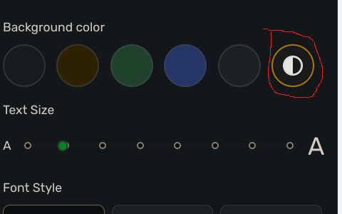
I had to play around with the settings as I had changed them during all of this, but I think I was finally able to get back to what I had by selecting the white and black circle to the far right in the “Aa” dropdown
and then selecting the default dark theme highlight style under Settings.
I have not seen a single rollback in the 4 years that I was with Lingq as a user. I know I have requested it occasionally. Usually such a request remains without response. @jt23 is right. From the outside it seems Lingq is not using source code management.
About database restore, I remember Lingq threw away a German lesson in a sweeping action and was not able to restore it, because the backup was only a partial backup. Then they asked users to check if they had backed up the lessons and that is how the lessons got restored. They had not tested their backups.
Not sure this might help others, but I managed to get the dark mode back in the Reader mode by switching back and forth between ‘System’ and ‘Dark’ mode in the General settings.
Thanks you for this! I can confirm that, after being stuck with this problem, switching to “System” and then back to “Dark” has fixed the problem for me. This is great, as it was killing my motivation with the improperly working UI colors.