When I first used LingQ back in 2012, the only way to use the service other than the website was a simple iOS review app that did not even allow one to create new LingQs. This app was designed for the iPhone or similar iPhone sized devices, so when I used it on my iPad Mini the picture was just stretched out and distorted to fit itself onto the much larger screen. It looked like shit but I still read entire books on it. Eventually I was able in German to move to reading without LingQ on the Kindle, which is of course much more convenient and easy on the eyes. At the time, I remember thinking how amazing it would be to have all the functionality of LingQ on an eInk tablet device like the Kindle. Well, it’s ten years later and now I can, and honestly it is such a relief.
I started a post recently asking people about their experiences with Onyx Boox devices. Onyx Boox is a Chinese company that makes and sells eInk devices, including a confusingly large array of eInk tablets. The interesting thing about their devices is that they run Android and one can install and run from the Google Play store any apps available, including the LingQ Android app. Not all apps work well of course, but after reading positive experiences from others, I bought the Onyx Boox Nova Air C and have been using it to read on LingQ for the last few days. This post basically counts as a complete brain dump of my thoughts on the topic, so here are the contents of my brain splattered all over a forum post.
Which device.If you do decide to get an Onyx Boox you will quickly get very confused by the number of choices available. They seem to release new devices at a ludicrous rate (three already this year, five in 2021, and eight in 2020). Three of their devices have colour eInk screens (Poke 2 Color, Nova 3 Color, and Nova Air C), though from what I have heard the first two are more experimental and it’s only the Nova Air C that is really a finished product.
Their devices break down into small (Poke series), medium (Nova series), and large (Max Lumi and Note series’). If you are looking for something cheap and small, then your best bet is probably the latest Poke device. If you are willing to pay more (and these are all very expensive) and you want a larger screen then Nova devices have a really nice screen size (7.8 inches, which is larger than the Kindle Oasis) and these are probably the best for LingQ related activities. Probably the larger devices are a bit too large and expensive.
The two stand out devices in the Nova series are the Air and the Air C, with the main difference being that the Air C is in color and is more expensive. Another two important differences is that the Air has a recessed screen and runs Android 10 whereas the Air C has a flush screen and runs Android 11. Overall, the Nova Air C is likely the best device for LingQ at present, but holy moly is it expensive.
General thoughts on Nova Air C. Firstly, the price is around 420 Euros in Eurostan. That is a lot for a device of that size and we should therefore expect a top quality product. There can be no complaints in this respect about the Nova Air C. It is extremely well build, has a slick design, and works extremely well. Here is a side-by-side comparison with the Kindle Oasis
For this, I used the Kindle App on the Onxy Boox and note that on both devices the brightness and warmth of the frontlights can be adjusted.
In terms of functionality, it has a good reader built in and you can install and other reader apps you want, such as the Kindle app if you want to get all your Kindle books from your Amazon account. It has a speaker with decent quality and one can connect bluetooth headphones (I have tested with AirPods).
The screen is overall really nice with very little glare and has a really nice and even frontlight. I also have a Kindle Oasis and unfortunately the Nova Air C screen is not competative with that device for the purposes of reading black and white eBooks in the normal way, but that’s more because of how beautiful the Kindle Oasis screen is. The colour screen looks good, but don’t expect the beautiful vibrant colours you might be used to on a normal screen. This is an eInk display and the colours are very washed out as you might expect.
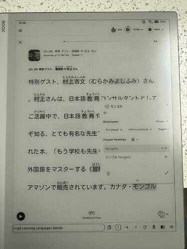
LingQ on this device. Finally to the most important part. How well does the LingQ app work on this device? Here is a video of me using the app so you can see.
Note that this is filmed with an iPhone camera and it does sometimes focus on my hand. In reality, the screen itself never becomes blurry. Also the playing of YouTube videos on the device can be made to look smoother by adjusting the settings.
From a technical perspective, it works 100% as far as I can see. I have not found a single feature that does not work exactly as intended. One can browse the library, open lessons, create LingQs, listen to the audio, get auto-TTS for selected words, and even play YouTube videos within the embedded YT video player (no idea why you would want to, but you can and it does not even look so bad). Somebody else somewhere said they had problems with syncing progress with the server. So far I have not had any problems with this.
From a performance perspective, it generally also works very good. The app loads relatively quickly, but takes quite a long time to load a lesson (similar to other devices I think). When in the lesson, the performace has been generally very good for me. As expected, it’s not as lightening fast as it is on my iPhone, but it is quite fast as you can see in the video. I would think if you are a complete beginnger in a language and at the end of every lesson 80% of the text is yellow, the slight delays might be a bit annoying, but for good beginner level or above it is fast enough for sure.
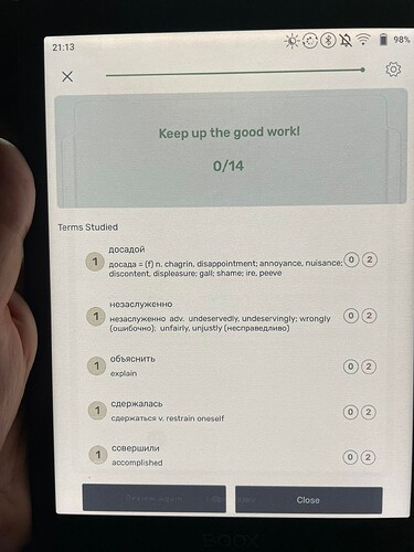
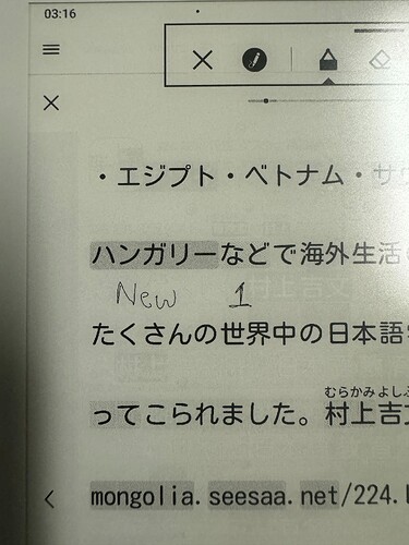
The highlighting is very clear as can be seen here
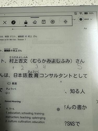
but the colours are much more washed out than intended. It is not ideal. Blue and yellow words are easy to distinguish, but status 1, 2, and 3 lingqs are mostly indistinguishable and the lines under status 4 lingqs are too thin to be seen. If that’s a dealbreaker for you then this is probably not the device for you.
A bit of a pet peeve of mine is the fact that in the browser and in the apps, it is not possible to have all the banners at the top and bottom go away when in a lesson so that you can enjoy just reading without unnecessary distractions. Imagine how annoying it would be if the Kindle didn’t let you get rid of the banner at the top while reading. I don’t see why the icon to review flashcards or switch to sentence mode has to be shown at all times while I am reading an ebook. This becomes even more annoying on a nice eInk screen since the potential to have a relaxing distraction free reading experience is so much higher.
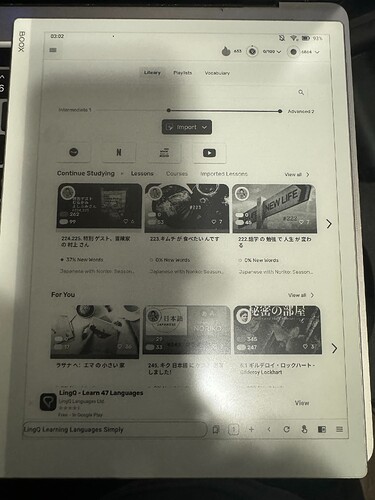
A problem with the eInk screen is ghosting, where images previously displayed leave an imprint on the background. With the default setup, it is quite bad for LingQ but a full refresh of the screen is very quick and fixes the problem, but doing it manually all the time is a bit tedious. This would be fixed if page turning automatically triggered full screen refreshes (as can be setup on other reading apps) but the app does not have this option since it was not designed for eInk screens. One can also set it up to do a full refresh after every set number of operations (I set it to 10 operations) and this almost entirely fixes the issue.
I did not show in the video, but selecting phrases works well so long as it is confined to one line. I have had a lot of trouble selecting phrases that extend over multiple lines. It does seem to work sometimes but it is difficult and I basically don’t bother trying anymore. Looking up words in online dictionaries works well, including Google Images so no issue there.
Typing in hints on this screen is a bit slow and tedious as anybody who has typed on an eInk screen would expect. It’s fine if you mostly rely on user hints and just type a small number, but if you have to type in many (e.g. if your language combination has not got many hints) then it will quickly become tiring.
Page turning is a bit of an issue. The swipe mostly works well but sometimes it takes a couple of attempts since the screen is not as reactive as the screens the app was developed for. Also the page turn buttons that are on the case that I got with the device do not work for it which is a shame. Ideally the left and right margins would be used for turning the pages (as on the LingQ browser version) but that is unfortunately not setup. Also many reading apps allow one to use the volume controls on the device for page turning and the buttons on the case actually become volume control by default for this. I think this would be a great feature for the LingQ app. Also the page turning animation is a bit annoying and reduces perfomance and makes ghosting worse. One can improve this with the app optimization on the device but removing the animation completely makes other things look terrible.
There is a shadow surrounding the bubble that comes up when new words and lingqs are selected that gives it an above-the-page feel on normal screens, but it looks much worse on eInk screens and contributes significantly to ghosting. It also unfortunately prevents me from making the text thicker and bolder using the app-optimization settings, because when I do that the shadow becomes really really thick.
Another annoying thing is the fact that sometimes when I click on a blue work to ignore it, it takes a few seconds for the suggested hint to appear, causing the ignore button to move down on the screen just as I am selecting it and causing me to instead save the hint. It’s not a big deal but it happens quite often and is annoying.
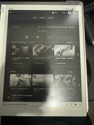
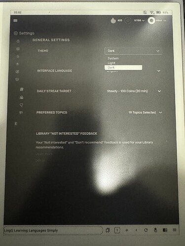
What about dark mode? It looks like shit. The main problem is ghosting. If you do a full screen refresh after each operation it looks alright but that’s a major pain. Don’t bother with dark mode on this device.
What about the LingQ website? It works surprisingly pretty good in the Chrome browser. I have no idea why you would want to use it instead of the app, but it does work.
How it could be improved. Obviously the powers that be at LingQ have their priorities and this might understandably not be one of them, but I hope this is something they are paying attention to. I see using LingQ on eInk devices as the obvious next step for them and since it already works so well, this is super low hanging fruit. A small number of minor adjustments could vastly improve the experience on Android eInk devices.
I think ideally there would be another theme in addition to light and dark on the Android app only called “eInk” or something like that. When turned on, it would look very much like the light mode, but with some tweaks for an eInk display. This could include things like removing the shadows around the bubbles, removing the page turn animation, and tweaking the colours of different status LingQs to make them easier to distinguish. All easy stuff to implement.
Anyway, enough for now. Let me know if you want any more images or videos.
