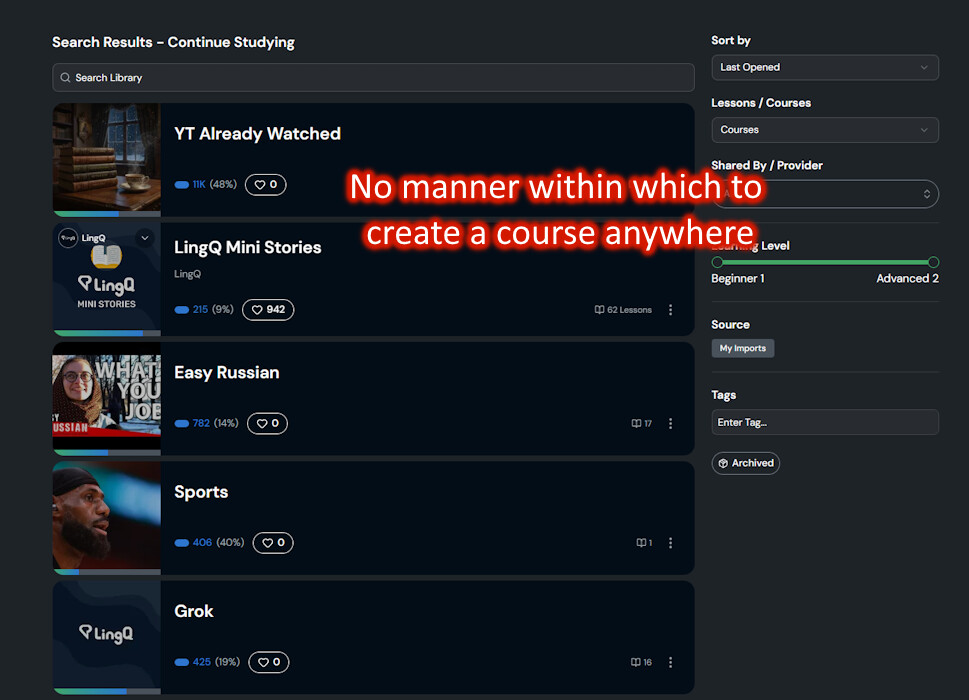
Just sharing a few personal thoughts on the current Library layout. These are only my opinions based on how I would like to see the site — happy to hear other perspectives or if I’m missing something.
POSITIVES
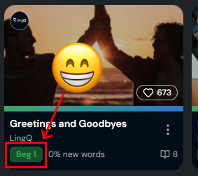
• The lesson level icons are noticeable, clean, and well designed.
SUGGESTIONS
-
Spacing issues
The large empty space between the top “Continue Studying” section (especially the big featured lesson on the left) and the “For You” section below feels unappealing and creates unnecessary dead space. -
Alignment problems
The “See All >” button is not aligned with the “Lessons / Courses / Imported Lessons” tabs and doesn’t sit flush with the recent lessons. -
Right sidebar balance
The right side of the screen currently feels off. While the sleek and narrow Listen panel makes sense, below the Review panel has too much empty space. Making both the Listen and Review boxes the same height would use the available space more evenly and look more balanced. -
Layout structure
Consider extending the “For You” suggestions into a full-width row (similar to the Books row below it). This would create clearer visual separation between the three main areas:
• Left: Lessons / Courses / Imported Lessons
• Top right: Listen / Playlists
• Bottom right: Review / VocabularyA continuous “For You” row underneath would help the layout feel more intentional.
-
Listen panel functionality
The current Listen panel looks clean, but it’s quite limited. It would be useful to have a small mini-interface on the main Library page that lets users switch between playlists or select another lesson from the current playlist without having to open the full Listen view. -
Source logos at the top
The logos for LingQ, Netflix, YouTube, Prime Video, and TikTok are inconsistently sized and hard to identify at a glance. Using more consistent symbol versions of the logos (instead of the full wordmarks) would improve clarity and visual balance.