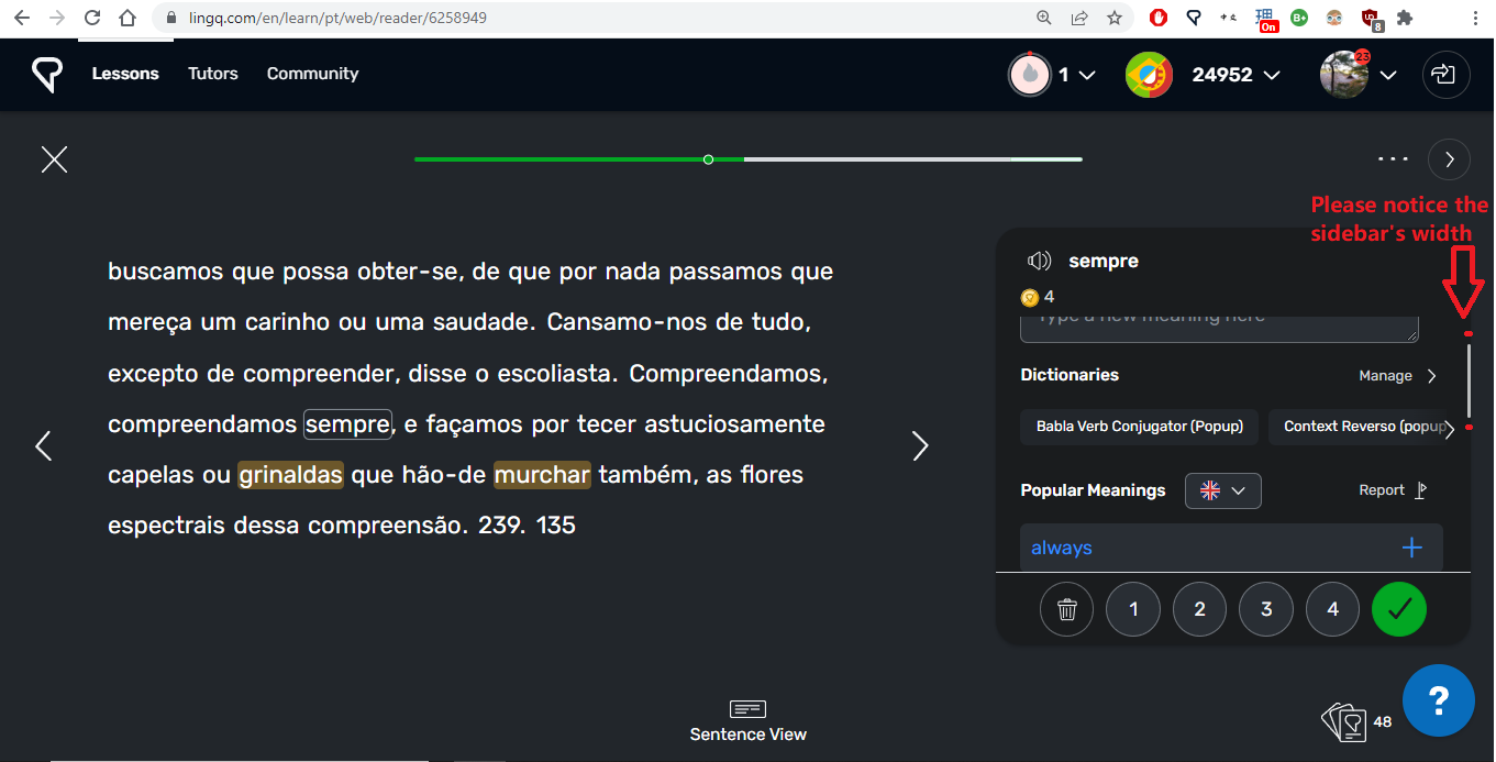
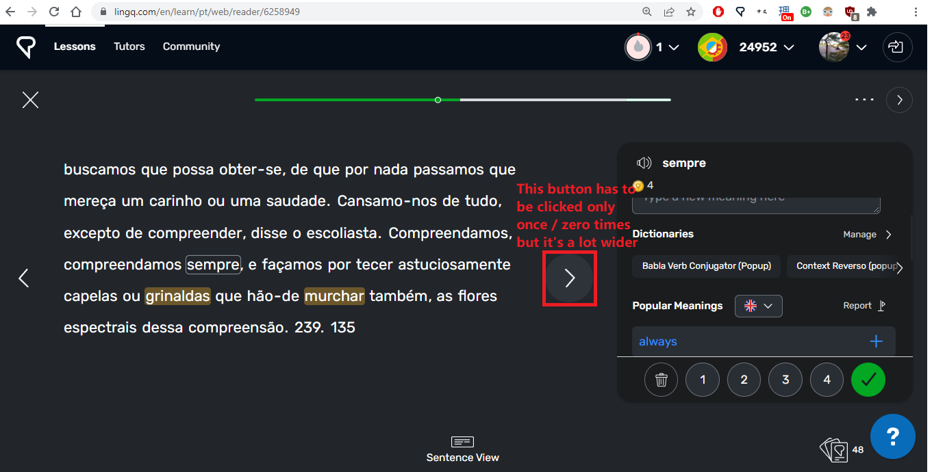
please do ![]()
Apparently these design ideas have been officially implemented in LingQ. I’ve updated the userstyle to not tweak at those things anymore, only on internal elements of the vocabulary sidebar, making it more compact.
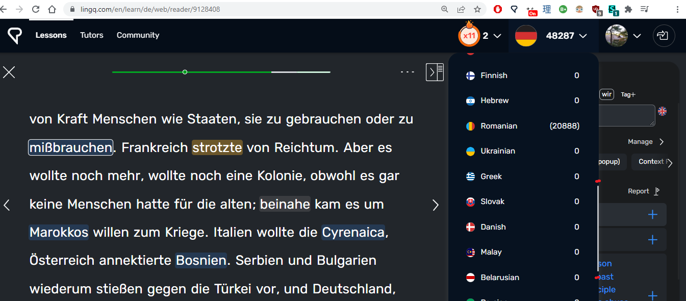
Indeed. They increased for the second time, and now it is exactly as your tweak was. The sidebar of lingq now is the best. When i use your tweak it is too little now, and i saw no change inside yet.
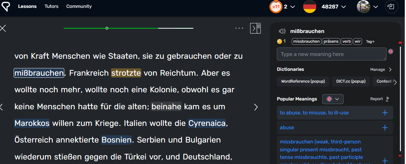
I actually find the dictionaries more accessible now. Previously it would only allow me to access one particular dictionary at a time for translating a particular word, but in the new version, it allows me to scroll across and use all of them.
Have those changes not already been made? The page looks significantly different from this now. You should refresh your page.
Thank you for your reply Mark.
An updated version, pictures taken today:

Thank you for taking it into consideration