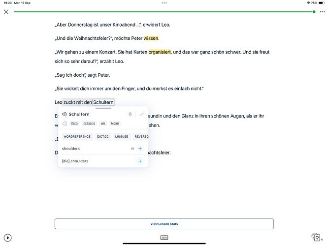
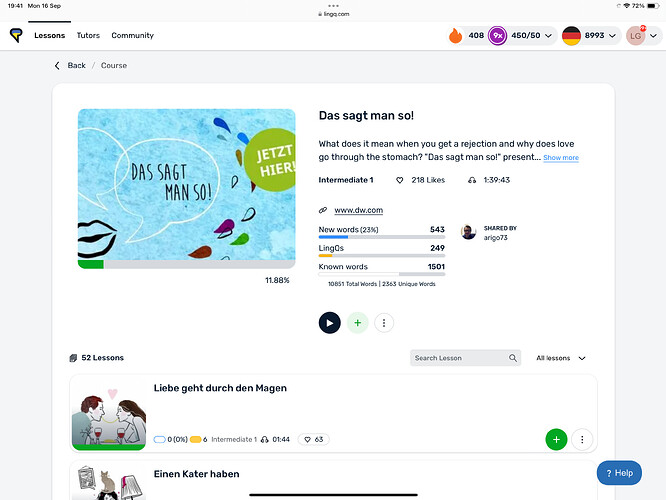
Today I used the web app i stead of the iPad app. I noticed a significant difference when I clicked on a word. On the iPad app I get helpful definitions such as this:
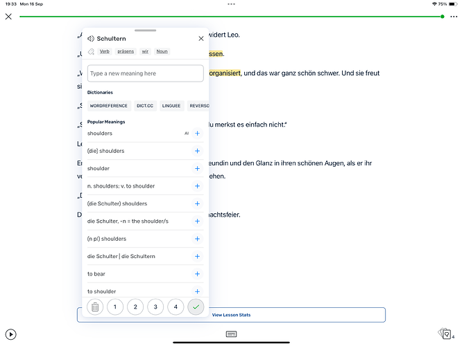
If I click on the dialog I get an expanded form:
That is helpful.
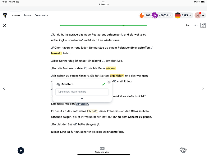
When I do the same in the web app I get this:
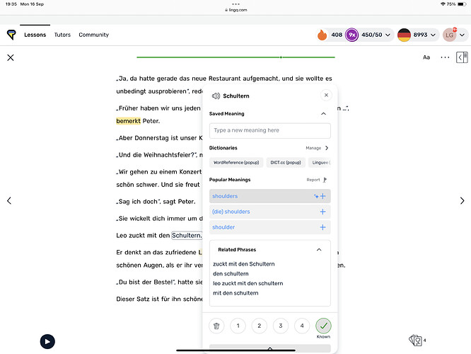
Which is pointless. I click on it and get this:
This is marginally better, but it’s different to and much less useful than the iPad app version which includes the singular form die Schulter for example.
The second issue is that when I close a lesson, I go back to the top level. If I want to go to the next lesson in the course, I have to go to the list of courses, then click in the course, then click on the next lesson. Why not just go back to the list of lessons in the course:
The user can easily get to the top level if needed using the tool bar at the top and clicking on Lessons.
