If you are like me, you probably like to import and read a lot of longer texts on LingQ and you might want a reading interface where the text itself plays a more dominant role and there are fewer distractions.
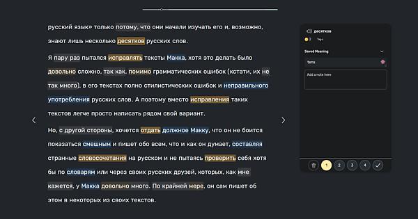
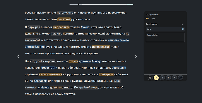
When I first got access to the beta of the new v5 web interface, the first thing that stood out to me was that there is a lot on the screen at once and that the actual text that I am trying to read takes up too little space, especially vertically. To fix this and to make the interface look how would like it to look when I am reading longer texts, I installed the Stylus Chrome extension which allows users to edit quite freely how they want websites to look, within limitations of course. I setup a simple script that takes the new LingQ reading interface and makes it look something like this
I have removed all elements not relevant when reading and extended the text box vertically so more of the text is visible. I experimented with extending the text also horizontally since there is still a lot of wasted space but this is generally not so good since, as anybody who has formatted books or articles will know, text becomes uncomfortable to read when spread out too much horizontally.
I set this up assuming the reader is in dark mode so it might look a bit strange in light mode. I can upload a light mode version if anybody is interested, maybe even changing a bit the colors of the highlighted which I found lacked contrast in light mode.
How to set this up
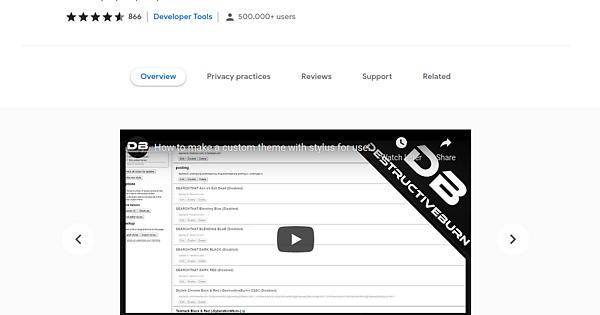
First step is to look at your browser and confirm that it is indeed Chrome. If not, the second step is to install Chrome. With Chrome installed, search Google for “Stylus Chrome extension” and you should find this extension as the top search result. The page you will land on should look something like this
and you can just click on the button at the top right to install the extension (note that for me it is already installed so the button gives the option to remove it instead of to install it).
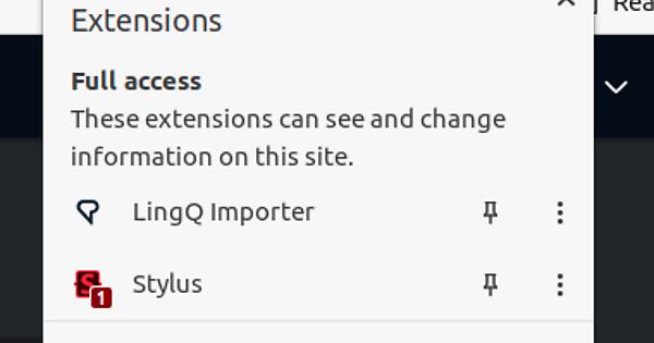
With the extension installed, you should be able to access it by clicking on the jigsaw piece at the top right of the window
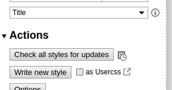
Simply click on Stylus and then on the “Manage” button in the box that appears. This should take you to a window that has the following on the left
At the bottom you will see a link labelled “Get and share styles” (IMPORTANT: do not click on the link labelled “Get styles” since that seems to go somewhere else and my style cannot be found if you follow that link). Click on this and then search for “lingq” in the search bar at the top of the page that opens and you will see my style. It is called “Simplified LingQ reading page (for dark mode)” which you can click on. Under the example image you should click the “Install” button. On the next page click the “Install style” button on the left and you should be done.
Usage
The new layout for the reader should be active immediately so you can start reading. You can deactivate it anytime by again clicking on the jigsaw piece button at the top right of the window
and then clicking on Stylus and then “Turn all styles off” on the box that appears. You can even setup a keyboard shortcut so you can instantly turn this on and off whenever you want but I won’t describe that just now (maybe add it later if people are interested).
Also good when reading is to make the browser full screen which for me on Chrome on Ubuntu is done by pressing F11.
Anyway, let me know if this is useful for you or if you have any nice ideas for how to improve it. Somebody with some more JS experience (this script is the full extent of my experience) might have some nice ways to make this better.
