I like having the dictionary popup follow my eye around the screen, so I can quickly glance back and forth between the sentence I’m reading and the definition of a word. This is faster than keeping it docked to the right side of the screen.
However, in my opinion, the popup’s positioning obscures important information.
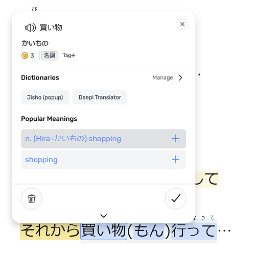
When the popup appears below the word, this is ideal! I can see the full row of text I’m reading, with transliteration above the word, and can glance down to see the definition.
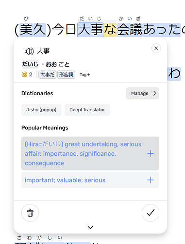
When the popup appears above the word, it is too close and obscures the transliteration. I understand this transliteration also appears in the popup, but it’s slower being forced to jump the eyes around to more places, especially when the location on-screen is inconsistent.
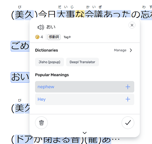
When the popup appears to the right of the word, it obscures the next word(s), making it more difficult to look at the sentence context while reading the definition.
Is there some way to improve or configure the popup’s positioning so that it:
a) never appears to the right. Always above or below.
b) when it appears above, it appears above the transliteration so they are still readable.


